


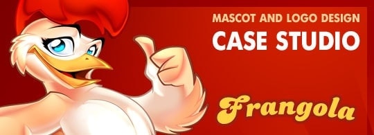
How to create a cartoon logo and mascot design in Photoshop
Hey buddies!
In this mascot design tutorial I will share some of my secret weapons in the creation of an illustrative cartoon logo design, from the first sketches to the final logo design, 🙂
Writing the brief of the logo design project
Frangola is a small company located in Angola which sells fried chicken. They found me through a design agency who made the briefing of the project and subsequent applications of the logo design.
The client wanted an illustrative logo design with integrated mascot design. On one hand, we wanted to cause high graphic impact when printing in big sizes; on the other hand, it had to be readable in small sizes (later on I will show you different versions I designed to solve this problem).
The design had to transmit freshness, confidence, optimism, health, flavor, quality.
Creating a logo mockup in Photoshop
To transmit the mentioned values I chose this typography named Dolphins, a good choice?.

The instructions were quite simple. The client wanted to incorporate the mascot design popping out of a circle, in a confident attitude, showing that their chicken is the number one. I offered various compositions using a character I designed some time ago, just for reference.

The client picked the first one.
My idea was to design a logotype that was easy to simplify. In small sizes, we could supress the illustration and keep just the brand. We´re taking this point again later.
Sketching a Mascot Character
The client described the mascot design as a hen with the next attributes: tasty, fleshy, fresh, bright eyes, confidence, number one, feminine touch.

The client’s corrections really improved the final design. The character gained some weight, we softenedd the lines to make the plumage smoother. We also gave it some volume and increased the curvature of the back to make the action line more pronounced. This way we get a more interesting pose.

Pay attention to the change in the action line, the second pose works better.
Designing the final Cartoon Logo Design
After some corrections here we go with the final sketch. Notice that we curved the lettering a little bit to give it more dynamism. We also changed the position of the character’s hand, the client chose this gesture among other five ones.

Let’s focus first on the brand, it had to work independently from the illustration but we’ll also integrate the character later.
I though warm colors would fit with the theme, so I picked yellow and brown colors
 When you’re designing an illustrative logo design, you must choose colors carefully. The logotype has to be readable as well as nice. In order to accomplish this, I suggest this test:

Desaturating the image will be enough. If the brand is still readable, that means we made a good choice with the colors. As you can see, in the image on the left there’s not enough contrast between yellow and brown colors, whereas in the image on the right, the contrast is correct and the lettering is perfectly readable.
Coloring the mascot design
I used Photoshop for the coloring, as I usually do. The most difficult part was painting the feather, I painted it all in just one tone, and then I added different shades. If you want to learn more about this technique, you can watch this video.
 Here you can see the evolution of the character.
 Here you can see the evolution of the character.
- Tip 1: use lots of layers. I started the plumage with a nearly-monochromatic shading, and then I added more layers with different shades.
- Tip 2: use different layer fusion modes, this way you’re adding volume. “Screen” mode is good to lighten areas, while “Multiply” mode is good to darken areas.
- Tip 3: if you want the illustration to look “3d”, reduce the amount of lines.
- Tip 4: when you’re finished, flat the layers and use “Dodge Tool” to merge tones and emphasize some areas.
Integrating the mascot design with the logo design
On one hand we have the lettering, on the other hand we have the mascot. Now let’s integrate both.

Summary
Remember: our goals was designing an eye-catching logo to print in big sizes, but we also needed a simplified version to print in small sizes, which still had to be fully readable.
![]()
So we designed different versions of the logotype:
- Full color brand in detail
- Brand in 1 and 2 colors, without detail
- Full color character and black&white
- Full color brand + character and black&white.
Final outcome
As good designers we are, we must pay attention to the presentation of our final work. If you have any contributions, criticism or questions, please comment. I’ll reply as soon as possible.
See you soon!!!
NEED A MASCOT LOGO DESIGNER?
More Mascot Logo Design Projects

Sport Mascot for Beach Games
Mascot Design
Fast Food Mascot
Mascot Design
Toyota Mascot
Mascot Design
Condition Air Mascot
Mascot Design
KSA Football Mascot
Mascot Design
Nigel
Posted at 21:07h, 01 Augustgreat walk through mate , I’ve been a fan for some time, nice to see how you get it done 🙂
teppou
Posted at 21:54h, 01 AugustA great read once again, thanks!
Arya
Posted at 07:45h, 02 AugustNice one buddy, great to see the work flow, learned a few things.Really loved the evolution part of the Character.
I have few question,
1.Do you always color and shade the full character even if you know only the top half of the character is going to be used in the final render ?
2. since I work mostly/exclusively in Illustrator, I was wondering is it easier to do the type of shading you did on the character in Photoshop then in Illustrator ? What would you advice, should I learn Photoshop if I want to do characters of this level of details,if yes, how easy or difficult it is to do it without a tablet, and also for Photoshop, what resolution do you work in ?
Mikael Cubillan
Posted at 09:31h, 02 AugustHola master Sergio!
As always your work is great!
You hit what the client wants, I wonder if you use a questionnaire to clients on design briefing?
Sometimes I got problems to deal on the clients because they don’t know what they want, any suggestions?
Mikael Cubillan
Posted at 10:11h, 02 AugustThanks Master Sergio,
The brief you mention is a great help.
Yeah I think your right about the clients…
I just ask about the brief because some clients ask to revise the work
different from the description they provide earlier, sometimes it takes
me more than a week just to do that revisions or start again because they have new idea.
Well, I’m just a newbie dealing on clients, I think I need more experience 🙂
Mista Buggs
Posted at 08:39h, 02 AugustYour work is just AMAZING Sergio!!
Sergio Ordonez
Posted at 09:04h, 02 AugustHi Arya, you are welcome 🙂
1.- Not always, just if the budget is reasonable and the client is interested in having the character as a standalone design to print corporate stuff.
2.- You can get almost the same outcome whatever software you use but I find vectors more time consuming and tricky, specially for so detailed illustrations, anyway just a personal preference.
I always draw and paint 90% of my illustrations in Photoshop because I have a Wacom Cintiq, I loose scalability but win in efficiency.
If you don´t have a tablet there is no advantage over Illustrator because you will need to use the vectorial tools anyway. So actually better using Illustrator if you are familiar with it.
In Photoshop I use canvas up to 8.000×8.000px, it´s enough for 99% of my requests. For big prints Illustrator is a must.
I hope it hepls 🙂
Sergio Ordonez
Posted at 09:46h, 02 AugustHi Mikael, thanks a lot 🙂
I have just a standard brief (http://www.sosfactory.com/blog/articles/freelancing/the-briefing/), sometimes I even don´t use a brief, it depends on the client.
There is clients who fill hundred of questions, tell you to make hundred of revisions and they still are not satisfied, they think more corrections you make better will be the design when actually could be the opposite. My best designs didn´t need more than a couple of corrections.
In other hand, there is clients with clear ideas, maybe just a feeling and can communicate it in a few sentences (like Frangola). Then they trust your judgement, give you full freedom and the work goes smooth, fun and nice.
The key is identifying both kind of clients and choose the second type… how to do this? I have no idea my friend, with time you get a feeling but never will know until you do the work.
Arya
Posted at 12:02h, 02 AugustThanks.
So I think I would stick to Illustrator then 🙂
Hope I would be able to achieve at least 50% of what you are capable of.
Great stuff.
Thanks
Arya
Onigumo
Posted at 14:35h, 02 AugustI’m my job i make a lot of logos about chicken food and rooster, but your work is awesome, I am a faithful follower of your work and put in practice your tutorials to improve my work.
Thanks
Andrés Mejía
Posted at 04:47h, 05 AugustVery interesting. I’m not a designer myself, but I found this quite amusing and inspiring!
Rosty
Posted at 05:43h, 05 AugustHola Sergio, que tal??
He estado siguiendo tu blog desde hace tiempo pero nunca había comentado nada pero ya surgió el momento, jajaja.
Tienes un super estilacho y estoy tomando esto para aplicarlo a mis diseños y crear mi estilo.
Oka mi pregunta es: en el logotipo ilustrativo de Frangola aplicas unos brillos finales, esos los haces a pulso o aplicas algún efecto en photoshop? y que seria mas factible usar Illustrator o Photoshop para elaborar este tipo de logos? se que hay muchos factores que influyen y también consideraras lo que busco pero siendo un logo y teniendo en consideración que debes usarlo para cualquier tipo de formato ya sea impreso o web no seria mejor tenerlo en vectores? esto es solo una curiosidad que me surge considerando un poco la complejidad de alguno (casi todos, jajajaja) de tus trabajos.
Gracias
makou
Posted at 14:28h, 05 AugustThis is cool, thank Sergio, you are the master
makou
Sergio Ordonez
Posted at 14:44h, 05 AugustHello Rosty,
a pulso sería complicado, para esos brillos suelo usar estilos de capa y transformaciones como crear contornos a partir de selecciones, algún toque de pincel de vez en cuando y sobretodo gradientes.
El software es cuestión de preferencias, el resultado puede ser idéntico en ambos casos. Personalmente me encuentro más cómodo con Photoshop. Trabajo en altas resoluciones, si el cliente necesita imprimir a grandes tamaños puedo crear una versión simplificada o crear todo en vectores si el presupuesto lo permite.
Muchas gracias a todos!
Rosty
Posted at 19:59h, 06 AugustSuper Gracias por responder tan rápido y aclarar mis dudas.
Espero sigas así
Shidus
Posted at 21:45h, 15 AugustHi Sergio!
As you can see I’m trying to write in English. Well, maybe with a little help from the translator. xDDDD
Great work, all your posts are magnificient and I’m going through here yet to see your posts.
Well, in the end, this was not so difficult, or so I hope… ^^
Thanks & Bye
Nelutu
Posted at 11:18h, 16 AugustBeautiful design 🙂
IkazNarsis
Posted at 09:24h, 16 AugustNice master sergio, inspirations for me, thanks..
Adriana
Posted at 23:37h, 18 AugustHola Sergio, vi dos de tus ilustraciones de chicas en Incredimail, y me preguntaba si habais colaborado con ellos o te robaron las caritas al descaro.tengo la imagen si gustas te la envio
Adriana
Posted at 00:54h, 19 Augustjajaj ok, nada mas era para asegurarme, no me gusta que roben XD
Sergio Ordonez
Posted at 00:39h, 19 AugustHola Adriana, me contrataron para que diseñara varios avatares, todo está correcto, gracias 🙂
remo
Posted at 05:00h, 20 AugustI can say wow! Beautiful color combination.
remo
Posted at 05:01h, 20 AugustHi Sergio can u help me to learn shading and highlights in vector drawing. If possible please suggest some blog/website.
Sergio Ordonez
Posted at 09:02h, 20 AugustHi Remo, thanks a lot buddy 🙂
Take a look to this one: http://www.sosfactory.com/blog/how-to/mascot-design/vectorial-illustration-with-illustrator/
andy
Posted at 17:46h, 20 Augustawesome skill.
no other words..
lol
hauff
Posted at 08:57h, 22 AugustJust amazing, fantastic and inspirational. Thanks for sharing!
AuraRinoa
Posted at 12:03h, 24 AugustMay I ask you which resolution you use to make that?
8.000 x 8.000 px (RGB? 300 dpi?)
Thanks 🙂
Sergio Ordonez
Posted at 19:00h, 24 AugustHi AuraRinoa, yes, around 8.000×8.000px at 300 dpi if you plain to print.
AuraRinoa
Posted at 09:49h, 26 AugustThank you so much ^_^
Pfff 🙁 My chicken is not so good as yours XD
AuraRinoa
Posted at 09:49h, 26 AugustHere ^^ http://www.aurarinoa.it/cosplay/uploads/pennuto_xsmall.png
Humberto
Posted at 02:34h, 23 OctoberEsta excelente, y es muy admirable que compartas tus técnicas
Gracias
Cristhiancr
Posted at 05:18h, 03 NovemberHey!, Hola Sergio, Oye una preguntota.. ¿Dibujas el personaje.. pero como lo subes a la PC? Escaneas o algo parecido? o algún programa?, Lo que pasa es que si sé dibujar… se manejar Photoshop… y me han pedido realizar un logo con su personaje o mascota, como proyecto de mi escuela… y bueno… No se como crear ese Personaje… lo dibujo y lo escaneo o como? o es directo en algún Software?
Te mando un saludo y te felicito por ese gran trabajo en el cual quede asombrado, esta genial.. espero y pueda crear estos tipos de ediciones y creaciones, al igual que tú.
Un saludo y espero me puedas ayudar.
Sergio Ordonez
Posted at 19:37h, 03 NovemberHola Cristhian, muchas gracias 🙂
yo suelo dibujar directamente en la computadora gracias a mi Wacom Cintiq, pero es un aparato muy caro. Existen tabletas más baratas pero no son igual de buenas para dibujar puesto que no dibujas directamente sobre la pantalla.
Así que lo mejor sería dibujar en papel, escanear y después entintar y colorear en Photoshop o Illustrator.
Suerte!
Cristhiancr
Posted at 04:15h, 04 NovemberA muy bien Sergio, gracias por responder….
bueno pues empezare a crear mi boceto jaja, por que, no cuento ahora con recursos para comprar la tableta jeje… en fin.
Un Saludo y Gracias por Responder a Mi Duda.
Ryan
Posted at 06:34h, 29 NovemberI liked seeing the development and the progress of the mascot illustration. The final design is definitely beautiful especially with the colors added in. It brought life to the overall drawing. For the past few days, I have been googling to find inspiration for my mascot design for an event I will be part of. And what I saw was definitely inspiring. The overall look of the Frangola illustration was perfectly balanced with the color and the proportions. I am now having my mascot drawing done. The initial sketches they sent were great and the price was relatively affordable compared to others. I liked how it looked thus far and I believe with some tweaks, it is going to look awesome. I did gave my designer this link as a reference point. Anyway, keep up the good work. Your blog rocks.
javier hernandez
Posted at 16:52h, 30 Novemberhola sergio:
te sigo desde hace 2 años cuando empeze con este de querer ser un diseñador como tú y te veo casi todos los dias, eres lo maximo hopmbre gracias por todas las enseñanazas, y los retos pues cuando ilustrar tus dibujazos! yo me reto a tratar de lograr tus efectos casi nunca lo logro pero me fascina, encontrar como logras todos esos detalles y me emociono cuando lo logro.
tengo una pregunta; yo hice unas tarjetas de mi empresa de expresion social, y mis dibujos los hice en photshop y cuaadno los lleve a la imprenta no me salieron como estaban en mi pc, me dijeron que tenia que hacer todo en vectores, pero pasas y resulta que me apegue tanto al photoshops, que me encabta dibujar sacenear, y en tintar, colorear en el mismo.
crees que debo cambiarme a illustrator, o tienes algun secreto que me sirva para que mis dibujos no salgan tan tristes y oscuro, y se pixelen un poco cuando los lleve a ala imprenta.
gracias
Sergio Ordonez
Posted at 23:42h, 01 DecemberHola Javier, muchas gracias, me alegra mucho 🙂
1.- Creo que no entendiste bien, no te explicaron bien o no tenían mucha idea. Vamos a ver, si diseñas con bitmaps en alta resolución por ejemplo 7000x7000px no tendrás problemas de pixelado siempre que imprimas a tamaños más pequeños (si quieres imprimir más grande entonces deberías usar vectores).
2.- Otra cuestión es el tema del color. No soy experto en impresión pero tengo un truquito. Abres tu imagen en Photoshop y presionas CTRL+Y para previsualizar en modo CMYK (observa que el título del lienzo cambia a RBG/CMYK). Si ves que los colores cambian demasiado (se apagan) es que usaste colores demasiado saturados. Para devolverla a RBG vuelves a darle a CTRL+Y.
3.- La solución al tema de los colores es fácil, en el “color picker” cuanto más arriba y a la derecha más saturado es el color si coges valores extremos son irreproducibles en imprenta. Fíjate además que cuando coges uno de estos colores demasiado saturados te aparece un signo de exclamación (color no seguro), si clickas en él, te devolverá el color seguro más parecido.
4.- Si después de esto no consigues una impresión decente ya es culpa del que imprime, ya sea por la tinta, la maquinaria o el papel.
Saludos
en la ventana emergente de selección de color
Esphan
Posted at 12:26h, 06 DecemberNice show man 🙂
Froi40
Posted at 12:55h, 23 Marchi’ve been wanting to find works such as your in the internet. Now i’ve found the best tutorial you shared with us. Sergio thank you very much for this.
Ocriador10listas
Posted at 14:39h, 25 JunePara la logo photoshop o Illustrator? Gracias:)
Sergio Ordonez
Posted at 12:46h, 29 JuneDepende de las necesidades del cliente y del presupuesto. Siempre es mejor vectores, pero si el logotipo es de tipo ilustrativo se invierte más tiempo, por tanto es más costoso. Si el cliente no va a imprimir a tamaños exageradamente grandes, con un archivo de Photoshop en alta resolución, es bastante.
Wisnu
Posted at 20:19h, 28 SeptemberSergio look at this..!! you have to see this!!!!
http://www.titodesain.com/layanan/desain-maskot
This man, his name is Tito, from indonesia, he put your work on his website without your permission, and they translate it into Indonesia language, so people will think that he’s the designer.. and even change the country Angola that you stated here into Kalimantan (Indonesia)… what do you say about this?
Please email me…[email protected]