Grid Based logo design construction
So here is the construction process of my first grid based commissioned cartoon logo design. Forum: All-in-one sharing device. My design approach is quite illustrative so it was quite shocking not let the hand draw freely. Sticking to basic shapes and grids is tough. So a really good exercise and another skillset that I will try to improve in upcoming projects!!
But… what is a grid system in Logo Design?
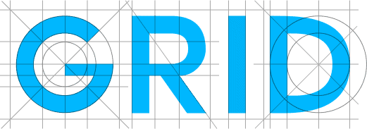
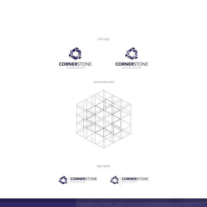
A grid system is just a background pattern that helps you to align elements, measure distances and value symmetry in your logo design. It also helps you to create perfect curves, smooth corners and smooth lines.
What are the cons of grid logos?

The main problem with grid based logos is that we tend to over rationalise the design process, making the logo boring and predictable. Just like it was made by a robot… no room for creativity.
So… should I used grids in my logo design process?
Yes! it’s a great tool to build accurate brands but do it wisely.

For example, a 100% squared grid based logo would be perfect for a lawyer firm that has tradition and stability as core corporate values. But could be really wrong if you want to build a logo for a creative artist.

Can you show me how to create a grid Logo Design?
Yes! This video is a good example on how you can start playing with grids for logo design.
Notice how the designer uses the smoke at the bottom of the rocket to break symmetry. It makes it interesting and the grid not too obvious and predictable, increasing the sense of movement.
Can you show me examples of grid based logo designs?
Not really, in opposition to blogs that create content just for search engines I prefer to focus in my own vision of the topic.
A quick search about grid based logo design on Google will give you hundred of examples, there is also hundred of posts about this topic.
But… what is your workflow at time to create grids based logos?
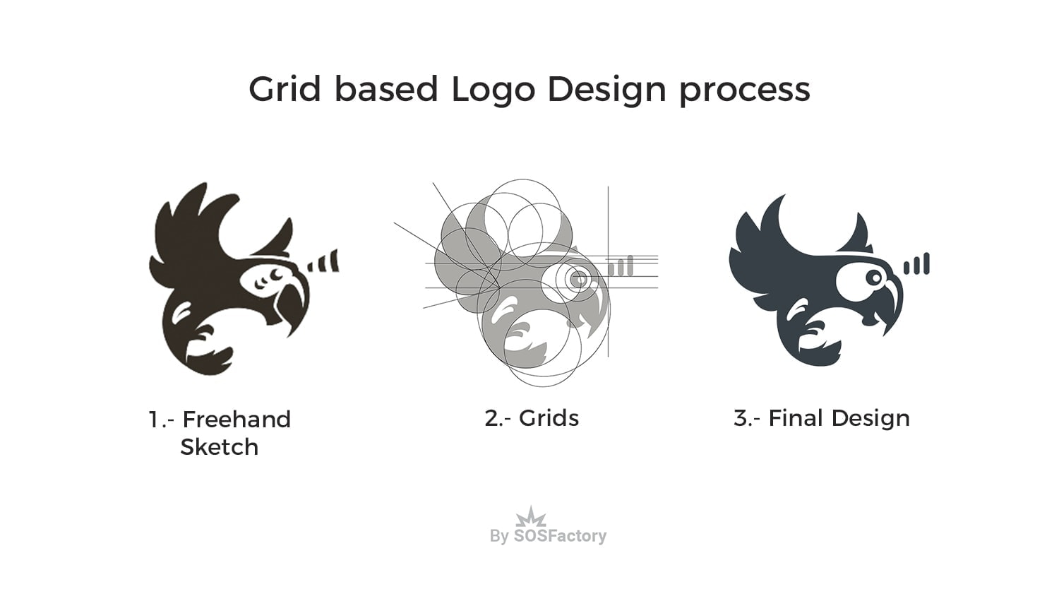
Since I’m a cartoon logo designer I tend to freehand draw my logos, which is perfect for sketching but not for final design. So I used Photoshop and my Wacom tablet for the sketch phase, once it’s approved by the client I pass it to Illustrator and apply grids in order to get a perfect design.

Once I have everything in the right place I apply my color palette checking that they are going to look good when printing. Then I create the whole brand identity including all main elements that could be used for print and web: vertical and horizontal layout, full color with gradients, limited gradient, 2 colors and just 1 color.
mahstudio
Posted at 08:21h, 12 DecemberI don’t really use grids in logo design, but what i do is that i obey the grid system on my logo designs.